


-
(#1) Vincent Connare
- 58
It's rare for something as common as a font to evoke hatred, but designer Vincent Connare's creation of Comic Sans has inspired an almost universal revulsion. The intentionally casual font was meant to match the lettering used in popular comic books, to serve as fun alternative to the more formal fonts most people were familiar with.
By now it's a walking (typing?) punchline, the go-to font choice of out-of-touch parents sending an e-card, your least favorite coworkers' emails and amateur graphic designers creating a flier for an event you will NOT be attending. The controversy came when people started using the (again, intentionally casual) font in serious documents including blog posts for a law firm and a Dutch war memorial. People were so angry when the informal font was used on important documents that they asked for a ban on the font in 1999 (it was a simpler time, when font choice was worthy of protest).
But Connare the designer didn't set out to create an object of derision when he developed the childlike font in 1994 (who would?). He just wanted to make something fun and cute looking, a font that brand new computer users could look at that looked less intimidating than Times New Roman.
He's proud of his creation, even if nobody else likes it, telling the Wall Street Journal, "If you love it, you don't know much about typography. If you hate it, you really don't know much about typography, either, and you should get another hobby."
-
(#2) Helvetica (Mike Parker)
While a form of Helvetica was first designed in 1957 in Switzerland by Max Miedinger and Eduard Hoffmann, it was typographic designer Mike Parker who gave us the common version of the font that's the most popular in the world. Miedinger and Hoffman set out to design a very clear, easy-to-read font with no fancy bells or whistles or other design flairs, and Parker continued in their footsteps (which is probably why the font is so common all over the world).
Born in London, Parker was responsible for the influential typesetting firm Mergenthaler Linotype Co., which added Helvetica to the common English lexicon. Helvetica is now found on everything from global subway systems to dozens of corporate logos to the Space Shuttle.
-
(#3) Claude Garamond
- Dec. at 81 (1480-1561)
Born sometime between 1480 and 1510, Frenchman Claude Garamond was one of the first independent engravers, making printed materials for customers on demand, rather than working for a printing company. As such, he was possibly the most important figure in the birth of commercial printing as an industry (except, ya know, bookmaking). The distinctive font that bears his name was born when he was commissioned by the King of France to print a series of books, based on the handwriting of the King's librarian.
The extremely ornate font fell out of favor after his death, but a cleaner version of it was revived in the early 20th century, and is one of the most popular typefaces in the world today.
-
(#4) R. Hunter Middleton
- Dec. at 87 (1898-1985)
Middleton was born in Scotland, but moved to Chicago to study at the Art Institute. He later served as the director of typography at the prestigious Ludlow Typographic Company for almost 40 years. You've likely never heard his name, but everyone knows his iconic Stencil font, the the go-to design for military-themed TV shows and toys, including MASH and The A-Team. He also designed Coronet, which wasn't as influential but was still very popular and can be seen in the signature on the Velvet Underground's first album and the credits for Star Trek.
-
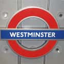
(#5) Edward Johnston
- Dec. at 72 (1872-1944)
The iconic font used on the London Underground was created by Edward Johnson (evidently who went to the same school of font-naming as Garamond), during the throes of the World War I. Johnston created the font as a commission from the London Underground's parent company, which asked for a font that had "the bold simplicity of the authentic lettering of the finest periods" and wouldn't be mistaken for advertisements. The font was redesigned in 1979 to add thickness to the letters.
-
(#6) Victor Lardent
- Dec. at 63 (1905-1968)
Where are our font-heads at? Get ready because it's Times New Roman time! Everyone who has ever seen a computer (which we literally has to assume includes you) is familiar with Times New Roman (or TNR as it is referred to by no one).
Now one of the most widely used typefaces in the world, Times New Roman was created in 1931 as a commission from the British newspaper The Times. Victor Lardent was the Times designer and draftsman tasked with developing the new font, but recent research by font guru Mike Parker shows that it might not have been Lardent, but aircraft and yacht designer William Starling Burgess who designed the iconic font. It seems like a lot of people are clamoring to take credit for this incredibly popular but also incredibly boring font.
-
(#7) Frederic Goudy
- Dec. at 82 (1865-1947)
The creator of over a hundred fonts, Goudy was self-taught in printmaking and design. He didn't design his first font until he was in his thirties, and didn't work professionally in design until he was almost 40. After that, he worked for a variety of firms and printing presses, and was also a teacher and author on font design. His most prominent creations were Californian, used by the University of California Press for decades; Goudy Old Style, used by a number of colleges; and Copperplate Gothic, found in stationary and books around the world.
-
(#8) Paul Renner
- Dec. at 78 (1878-1956)
German typographer and designer Paul Renner created the clean, classic Futura font in the late 1920s as a reaction to what he found to be the degeneracy of modern design and music. Renner was a prominent anti-Nazi, condemning their cultural policy in a self-produced 1932 booklet. Renner was soon dismissed from his teaching post, arrested, and blackballed in the design industry. He fled to Switzerland, and died in 1956.
Futura ended up achieving iconic status by being the go-to font for director Wes Anderson. He uses it in all of his films and it fits is clean, symmetrical, visual style so well. And as far as we know, Wes Anderson is also anti-Nazi, so it looks like the font is in good hands.
-
(#9) Myriad (Robert Slimbach and Carol Twombly)
Slimbach and Twombly were principle designers at Adobe when they created Myriad, a clean sans-serif font that would become world-famous as the font of choice for Apple, replacing Garamond in 2002. (So if you were wondering where you'd seen it before, it's the font used for the word "iPod").
It's also the brand font for a number of other major companies, including Rolls Royce and Linkedin, major universities, and the Royal Air Force. Slimbach still runs Adobe's type design department, while Twombly retired shortly after designing Myriad.
-
(#10) Arial (Robin Nicholas and Patricia Saunders)
Created by Nicholas and Saunders for the design firm Monotype Imaging, Arial was created to be metrically identical to Helvetica, so that a document designed in Helvetica could be displayed and printed in Arial - thereby avoiding the need to pay for a Helvetica license (it could be argued that Arial just wanted to be part of your word... document. We're sorry about that, but you try making jokes in an article exclusively about fonts.). From there, Arial took off in a number of different variants, and was chosen by Microsoft as a core font for Windows 3.1. The deal between Monotype and Microsoft was said to be so expensive and complex that Monotype's director claimed the computing giant spent enough money to fund a small country.
Arial is probably used by more people, but Helvetica is preferred by designers. Nicholas and Saunders have designed a number of other popular fonts, including Bembo, Cambria, and Clarion.
-
(#11) Courier (Howard "Bud" Kettler)
We have a soft spot for Courier and Courier New, because if you had a college paper that needed to reach a minimum page count, Courier New took up just a teensy bit more space, and we needed all the space we could get to pad out the page length.
Designed to mimic the letters left by a strike-on typewriter, Courier was designed in 1955 by Howard Kettler for IBM. But IBM intentionally didn't trademark it, putting the font in the public domain, available for almost anyone to use. Because of its low cost, Courier became the State Department's font of choice until 2004, and is the industry standard for screenplays and computer code. Despite the success of Courier, Kettler continued working as a staff designer at IBM until he retired, and he died in 1999. We thank him for his service.
-
(#12) Adrian Frutiger
- 90


New Random Displays Display All By Ranking
About This Tool
Although we use a variety of fonts every day, few people know their origin stories. Who has created so many different fonts? The creative stories behind these fonts are sometimes fascinating and even have some surprising sources, some people may be inspired by cartoon lettering, music, and other forms, some are based on market demand, technical equipment update requirements, or design and artistic innovation. You must also have one of your favorite fonts.
Here are some of the origin stories of the most famous fonts' designs in the world. The generator has 12 items that describe various stories of fonts, welcome to check these inspirational creations.
Our data comes from Ranker, If you want to participate in the ranking of items displayed on this page, please click here.